Digital Media
First City Track Club Logo
Medium: typography
Created: 2022
Size: 8 x 4
One of the first, and as of now only, pieces that I was commissioned is a logo for the First City Track Club based in Leavenworth Kansas. My brother ask me to design the logo and it was such a huge honor. I utilized a color scheme of navy for the lettering and a stripe of hot pink in the center. I want to create the effect of tube sock stripes with the pink stripe and the negative space in between.
A Kids Dream City
Medium: graphic design
Size: 15” x 17”
Created: 2019
Whenever I see the horizon of a city, it always amazing to see the progress that mankind has achieved to get there. This piece shows my interpretation among how far cityscapes will be in the future from the perspective of a young child. Modern architecture does have some marvels such as the Burj Khalifa or One World Trade Center with there unique silhouettes but what if convention was thrown out the window with buildings that flex their structures or spires squiring and bouncing observatories. Logic is not a factor that should be taken when entering this city
Inspiration quote
Medium: graphic design
Size: 17” x 11”
Created: 2019
Strength is an important skill that one must have to fortified their own mind. Several key figures in history were able to do this through bravery. This piece combined an inspirational quote from the famous poet and a solider. I could have not thought of anybody better than a Union Civil War general to accompany the quote and I wanted to choose Ambrose Burnside do to his unique facial characteristics.
Streetcar poster
Medium: graphic design
Created: 2022
Size: 18” x 24”
The light only shows a sliver of what we truly are. Lights are an important aspect in Tennessee Williams Play “A Streetcar named desire”. The titular character, Blanche, is afraid of men seeing her appearance also reflects on her past sins and behaviors. All, expect one, of the characters suffer through insanity, betrayals and domestic violence. The lantern shows only a sliver of the actors heads to contrast the darkness that they have inside of them
Grungulator
Medium: graphic design
Size: 11” x 17”
Created: 2019
This was a series of posters that are a parody of the extreme nature of heavy metal music. Each poster has an extreme location for where the concert is held. The first poster is for there concert in the center of Jupiter’s Red Eye were the trip would take over several centuries and the winds on Jupiter are over 200 mph. The cost is also an exorbitant price as it’s over in the quadrillions. The second concert is located deep below the Bermuda Triangle were many mysterious accidents occur within its boundaries.
Delabra font
Medium: typography
Size: 21.25” x 6.25”
Created: 2022
Creating a new font was huge challenge for me to overcome. Blackletter form was the style that Delabra is based on and the inspiration was imagining if the counters inside of the letters were melting like candle wax. Delabra comes from the second half of candelabra, a container for candles. The hardest challenge of this, was trying to make all of the letters readable. A lot of letters share simulators but since my font works on the premise of being melting and bending on its own weight and I circumvented this by giving each letter there own bend and reducing the amount of counters in them.
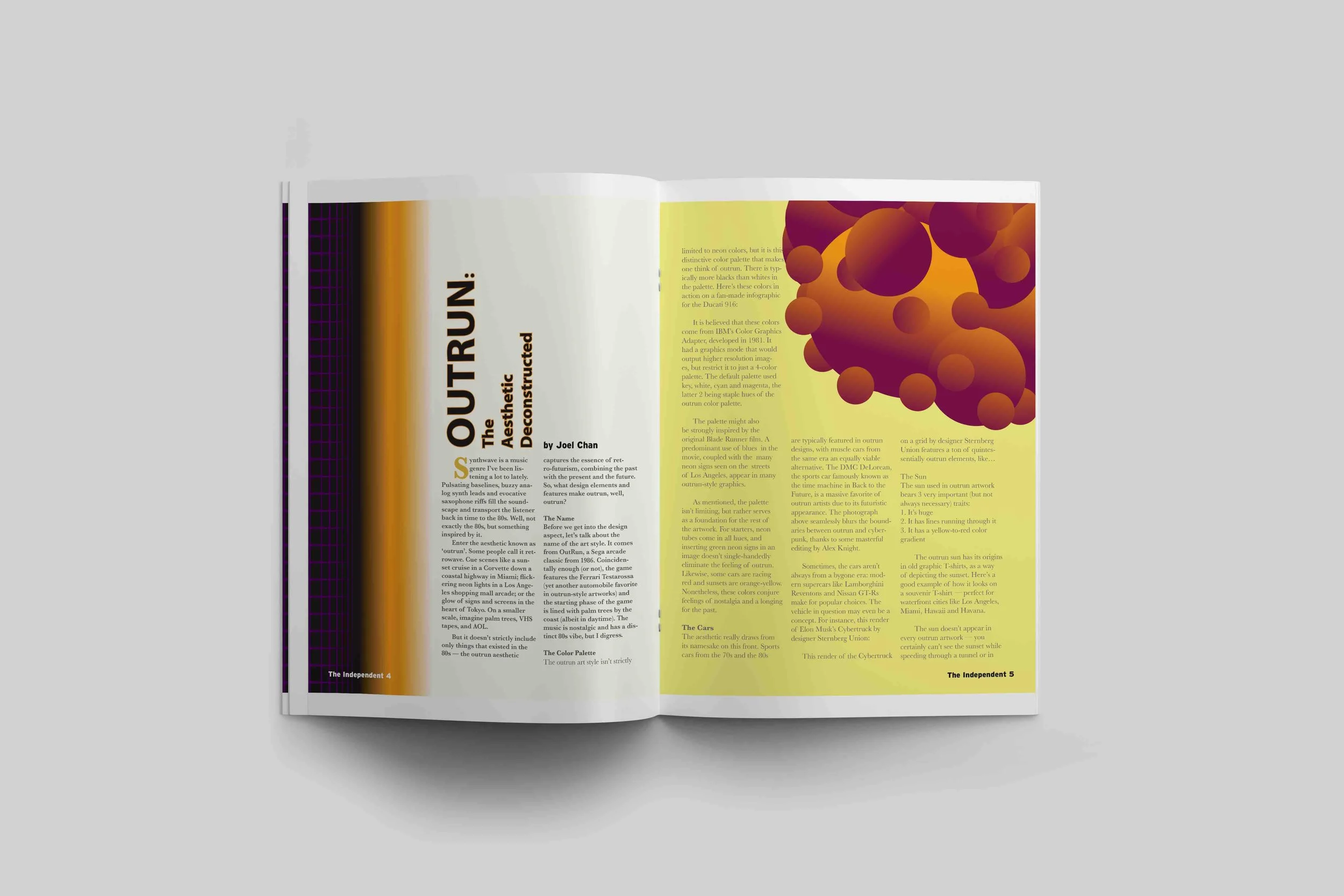
Magazine Spread 1-2-3
Medium: Typography
Size: 11” x 17”
Created: 2022
This was my first time creating a magazine spread. In the past, I would create pamphlets that were rudimentary but this was the chance to learn the principals of magazines design. I chose articles that represent typography and graphic design. Highway font was my favorite to design by building my own signs from reference photos. Out-run was awesome in its color scheme of orange and neon purple to represent its famous color schemes. Lastly Corporate Art was a great satire on the minimalistic style of corporate art.
Dive Dive Dive!!!
Medium: typography
Created: 2022
Size: 4” x 4”
The ocean is a wonderful place and most of my inspiration for my sketches comes from the complexity and mysteries of the deep. After several attempts at transforming various names of ships and water vehicles into their respective names, I decided to tackle the submarine. The form is easily recognizable and has lots of ways to tackle its shape. I used the b for the scope, n for the fines and the e to carry the propeller.


